專注Java教育14年
全國咨詢/投訴熱線:400-8080-105
更新時間:2021-06-08 11:05:20 來源:動力節點 瀏覽1004次
1.單列布局
(1)普通布局(頭部、內容、底部)
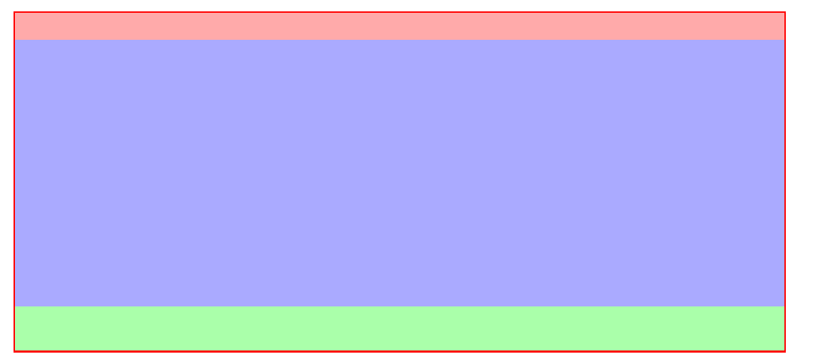
    <div class="container">
        <header></header>
        <div class="content"></div>
        <footer></footer>
    </div>
.container {
            width: 80%;
            margin: 30px auto;
            border:2px solid red;
            box-sizing: border-box;
        }
        .container header {
            width: 100%;
            height: 30px;
            background: #faa;
        }
        .container .content {
            width: 100%;
            height: 300px;
            background: #aaf;
        }
        .container footer {
            height: 50px;
            background: #afa;
        }
(2)內容居中(內容區域為80%寬度,采用margin:0 auto;實現水平居中)
<!DOCTYPE html>
<html lang="en">
<head>
    <meta charset="UTF-8">
    <title>Document</title>
    <style type="text/css">
        .container {
            width: 80%;
            margin: 30px auto;
            border:2px solid red;
            box-sizing: border-box;
        }
        .container header {
            width: 100%;
            height: 30px;
            background: #faa;
        }
        .container .content {
            width: 80%;
            height: 300px;
            margin: 0 auto;
            background: #aaf;
        }
        .container footer {
            height: 50px;
            background: #afa;
        }
    </style>
</head>
<body>
    <div class="container">
        <header></header>
        <div class="content"></div>
        <footer></footer>
    </div>
</body>
</html>
2.兩欄布局
(1)采用float 左邊固定大小,右邊自適應
左側采用float:left往左浮動,右側margin-left:200px,留出左側內容的空間。
<!DOCTYPE html>
<html lang="en">
<head>
    <meta charset="UTF-8">
    <title>Document</title>
    <style type="text/css">
        .wrapper {
            /* width:80%;和margin 是為了方便我截圖*/
            width: 80%;
            margin: 50px auto;
            border:2px solid #aaa;
            box-sizing: border-box;
            /*采用bfc清除浮動*/
            overflow: hidden;
        }
        .nav {
            float: left;
            width: 200px;
            background: #faa;
            height: 500px;
        }
        .content {
            margin-left: 200px;
            height: 500px;
            background-color: #aaf;
        }
    </style>
</head>
<body>
    <div class="wrapper">
        <div class="nav"></div>
        <div class="content"></div>
    </div>
</body>
</html>
(2)采用display: inline-block; 和 calc() 實現
由于inline-會把空格和回車算進去,所以我們在wrappper中設置font-size:0來清除影響。當然,打包出來的壓縮格式可以忽略。
<!DOCTYPE html>
<html lang="en">
<head>
    <meta charset="UTF-8">
    <title>Document</title>
    <style type="text/css">
        .wrapper {
            /* width:80%;和margin 是為了方便我截圖*/
            width: 80%;
            margin: 50px auto;
            border:2px solid red;
            box-sizing: border-box;
            font-size: 0;
        }
        .nav {
            display: inline-block;
            width: 200px;
            background: #faa;
            height: 500px;
        }
        .content {
            width: calc(100% - 200px);
            display: inline-block;
            height: 500px;
            background-color: #aaf;
        }
    </style>
</head>
<body>
    <div class="wrapper">
        <div class="nav"></div>
        <div class="content"></div>
    </div>
</body>
</html>
(3)采用flex實現,左側固定大小,右側設置flex:1,即可實現自適應
HTML不變,css如下:
.wrapper {
            /* width:80%;和margin 是為了方便我截圖*/
            width: 80%;
            margin: 50px auto;
            border:2px solid red;
            box-sizing: border-box;
                        /*flex布局*/
            display: flex;
        }
        .nav {
            width: 200px;
            background: #faa;
            height: 500px;
        }
        .content {
            flex: 1;
            height: 500px;
            background-color: #aaf;
        }
3.三欄布局
(1)采用float浮動,左右大小固定,中間自適應
<!DOCTYPE html>
<html lang="en">
<head>
    <meta charset="UTF-8">
    <title>Document</title>
    <style type="text/css">
        .wrapper {
            width: 100%;
            margin-bottom: 30px;
            border:2px solid red;
            box-sizing: border-box;
        }
        .wrapper .left {
            width: 200px;
            height: 300px;
            background: #faa;
            float: left;
        }
        .wrapper .right {
            width: 200px;
            height: 300px;
            background: #afa;
            float: right;
        }
        .wrapper .content {
            height: 300px;
            background-color: #aaf;
            margin:0 200px;
        }
    </style>
</head>
<body>
    <!-- 三欄-浮動布局 -->
    <div class="wrapper">
        <div class="left"></div>
        <div class="right"></div>
        <div class="content"></div>
    </div>
</body>
</html>
采用inline-block 與兩欄布局類似
.wrapper {
            width: 100%;
            margin-bottom: 30px;
            border:2px solid red;
            box-sizing: border-box;
            font-size: 0;
        }
        .wrapper .left {
            display: inline-block;
            width: 200px;
            height: 300px;
            background: #faa;
        }
        .wrapper .right {
            display: inline-block;
            width: 200px;
            height: 500px;
            background: #afa;
        }
        .wrapper .content {
            width: calc(100% - 400px);
            display: inline-block;
            height: 400px;
            background-color: #aaf;
        }
這里我們給每個容器的高度不同,結果:
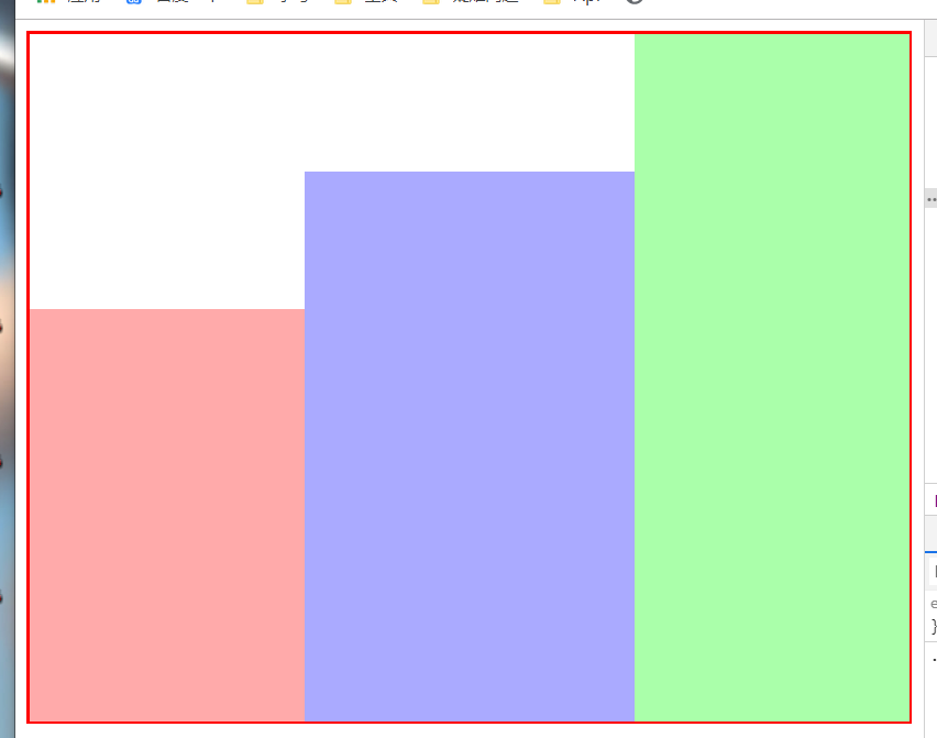
我們可以發現他是底部對齊的,只需改變他的對其方式即可。vertical-align: top;
.wrapper .left {
display: inline-block;
width: 200px;
height: 300px;
background: #faa;
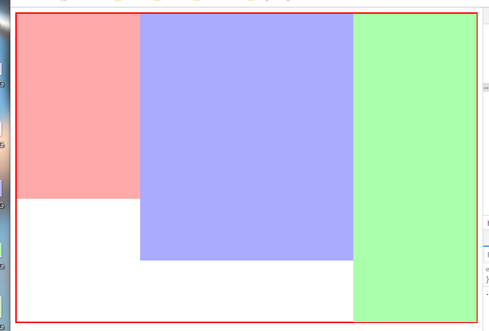
vertical-align: top;/*添加*/
}
.wrapper .right {
display: inline-block;
width: 200px;
height: 500px;
background: #afa;
vertical-align: top;
}
.wrapper .content {
width: calc(100% - 400px);
display: inline-block;
height: 400px;
background-color: #aaf;
vertical-align: top;
}
結果:
(3)采用flex布局
.wrapper {
            width: 100%;
            margin-bottom: 30px;
            border:2px solid red;
            box-sizing: border-box;
            display: flex;
        }
        .wrapper .left {
            width: 200px;
            height: 300px;
            background: #faa;
        }
        .wrapper .right {
            width: 200px;
            height: 500px;
            background: #afa;
        }
        .wrapper .content {
            flex: 1;
            height: 400px;
            background-color: #aaf;
        }
以上就是動力節點小編介紹的"CSS布局大全",希望對大家有幫助,如有疑問,請在線咨詢,有專業老師隨時為您服務。
 Java實驗班
0基礎 0學費 15天面授
 Java就業班
有基礎 直達就業
 Java夜校直播班
業余時間 高薪轉行
 Java在職加薪班
工作1~3年,加薪神器
 Java架構師班
工作3~5年,晉升架構
提交申請后,顧問老師會電話與您溝通安排學習


官方微信

官方抖音


 京公網安備 11030102010736號